Vertical Portrait Displays versus Horizontal Landscape Displays – Which is Better?

In the Audio Visual industry, choosing and mounting display screens is a large segment of our business and services. And upon conducting research for this blog post, other industries including marketing, psychology, and photography, have a lot to say about which type of display, vertical or horizontal, is better. And the winner seems to be…
Keep reading to discover the highlights from our research.
Horizontal landscape displays make a more lasting impression.
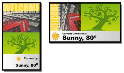
According to the Digital Signage Insider, over the years they’ve had lots of people ask which orientation — portrait or landscape — they’d recommend. Most were of the opinion that a screen mounted vertically (in portrait orientation) was more novel, and would therefore be more eye-catching. But to their knowledge no one had ever actually tested this, so they set up their own experiment. They tailored images of venues featuring portrait or landscape screens to preserve the size of the text on each screen… All other variables, like color, contrast and background environment, were kept the same to make sure they were doing a real, apples-to-apples comparison. The results were quite surprising – almost triple the number of viewers preferred the landscape orientation.
They thought up dozens of hypotheses to explain why a boring, landscape-oriented sign might make a more lasting impression than an arguably more novel portrait-oriented one. For example, maybe viewers spend more time looking at the display instead of the message, looking at the visual elements instead of the text, or even looking at the screen in the environment to try and “make sense” of its perspective. The favorite theory, though, goes back to the notion of the active attention zone, a concept they looked at a few years ago. In short, humans only pay attention to a small portion of what we look at — usually just what’s directly in front of us. Because our field of view is so much wider than it is tall, it may be that a horizontally-oriented screen fits more naturally into it, and we’re therefore more likely to give it attention. This is hypothetical, of course, but does seem to fit in with some of the prevailing psychological models of visual attention, for what that’s worth.
Photographers seem to prefer horizontal orientation when capturing and displaying media images.
Chase Jarvis, an acclaimed visual artist, states and asks, “Knowing how to deliver images that play nicely with the current design trends is paramount for any working photographer. But why does one orientation work better than another?” His friend and guest blogger answers while breaking down the reasoning.
- Tension and Space – “Fill the Frame” – every photographer is supposed to know this and there is a big difference between filling the frame with vertical versus horizontal orientation. Evidently, horizontal orientation allows some breathing room and less tension for space around the image to include text and a message.
- Context and Room – Horizontal orientation allows for the photographer to include context and background in the picture while also allowing the model room for movement.
- We See Horizontally – In Western cultures, we read left to right. We scan left to right. We are trained to see things in horizontal, like on our widescreen TVs and our iPads.
The Verdict: A horizontal landscape orientation seems to be the winner in this round of “versus.”
So, whether you are designing a display screen or taking a picture, the findings support that your viewers will typically prefer your images and text on a horizontal screen. And we are happy to help you purchase and mount the perfect one.
Enjoying the research!

